 — Internship & Capstone · now becoming a real product
DVA
An AI chatbot that turns scattered cloud-platform knowledge into fast, trustworthy answers.
↓Skip to solutionContext
What is DVA?
DVA is an AI-powered chatbot built for teams managing a live cloud platform. When something needs attention, users need answers fast — but the information they rely on is scattered across systems, buried in documentation, and hard to surface under pressure.
DVA removes that friction. Instead of searching, users ask.
I was the sole designer for DVA during my internship, owning the experience end-to-end from research to handoff. Alongside it, my capstone ran as a parallel workstream — a related concept within the same product space. The two projects fed into each other throughout, sharpening the direction of both.
The problem
The right information, at the wrong time, in the wrong form.
Users of the platform are responsible for staying on top of live data and responding when something needs their attention. The information they need — alerts, logs, guides, compliance documentation — exists, but it’s never in one place. In time-sensitive situations, that gap has real consequences: delays, errors, decisions made without the full picture.
Why should finding the right information feel this hard?
Information is impossible to find fast
The platform holds everything users need — but finding the right document, alert, or log in the moment means navigating multiple systems with no clear starting point. Users weren’t failing because the information didn’t exist. They were failing because the path to it was too slow.
Time-sensitive situations have no room for friction
When something needs immediate attention, every second of searching is a second the problem is growing. The gap between “something is wrong” and “I know what to do” was too wide. Users needed to move fast, but their tools were built for browsing, not urgency.
Documentation exists but isn’t usable in the moment
Guides, compliance documents, and operational references were all technically accessible — but the format wasn’t designed for someone under pressure making a quick decision. Reading a full document to find one answer isn’t a workflow. It’s a barrier.
These three problems point to the same root cause. That became the design brief.
Research
I walked in thinking the problem was speed. I walked out knowing it was trust.
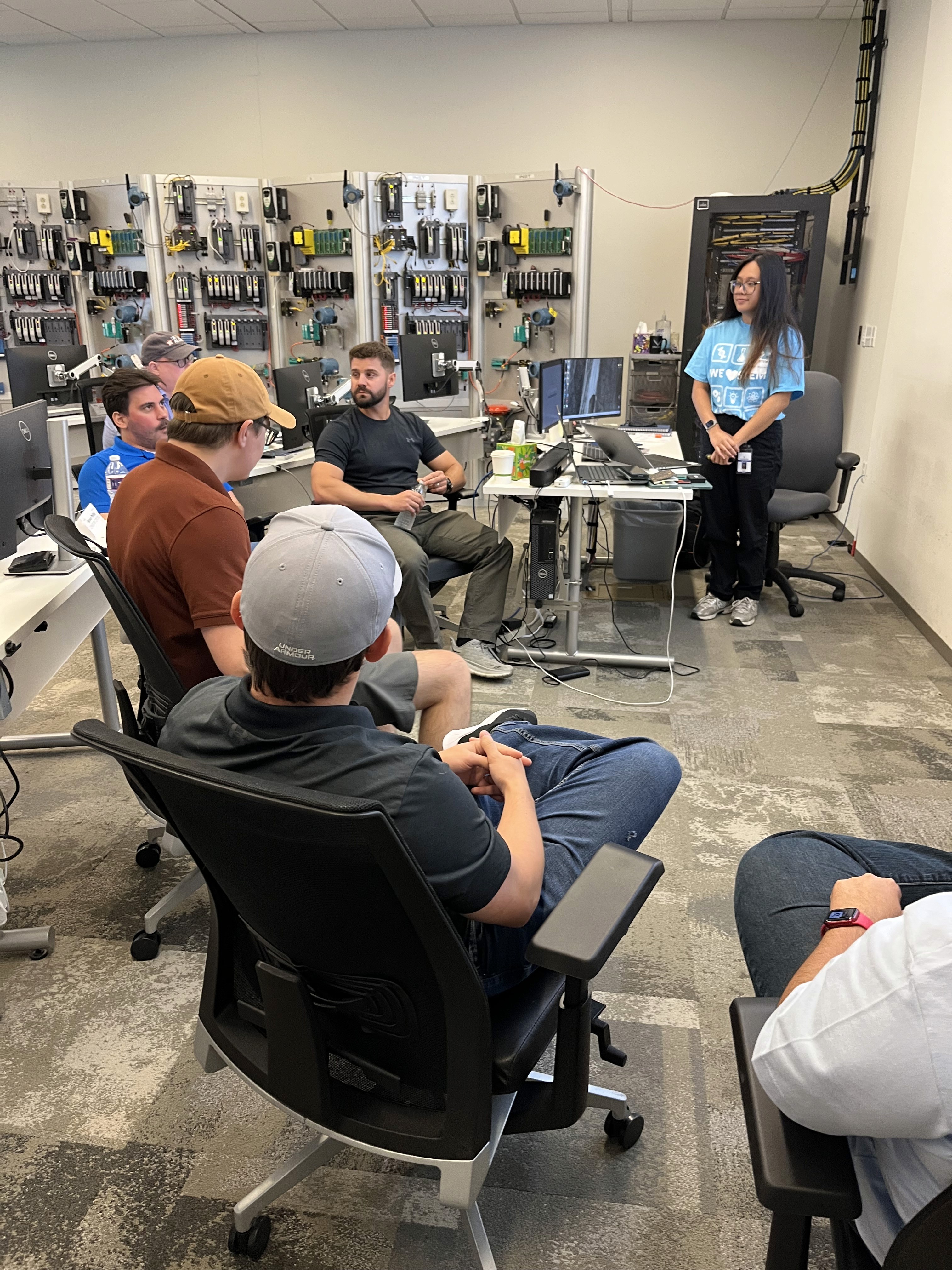
To understand the problem from the inside, I ran group interviews with users across multiple business units — real stakeholders who work with the platform daily. Bringing groups together rather than testing one-on-one surfaced something more valuable: how these teams actually talk about the problem with each other.
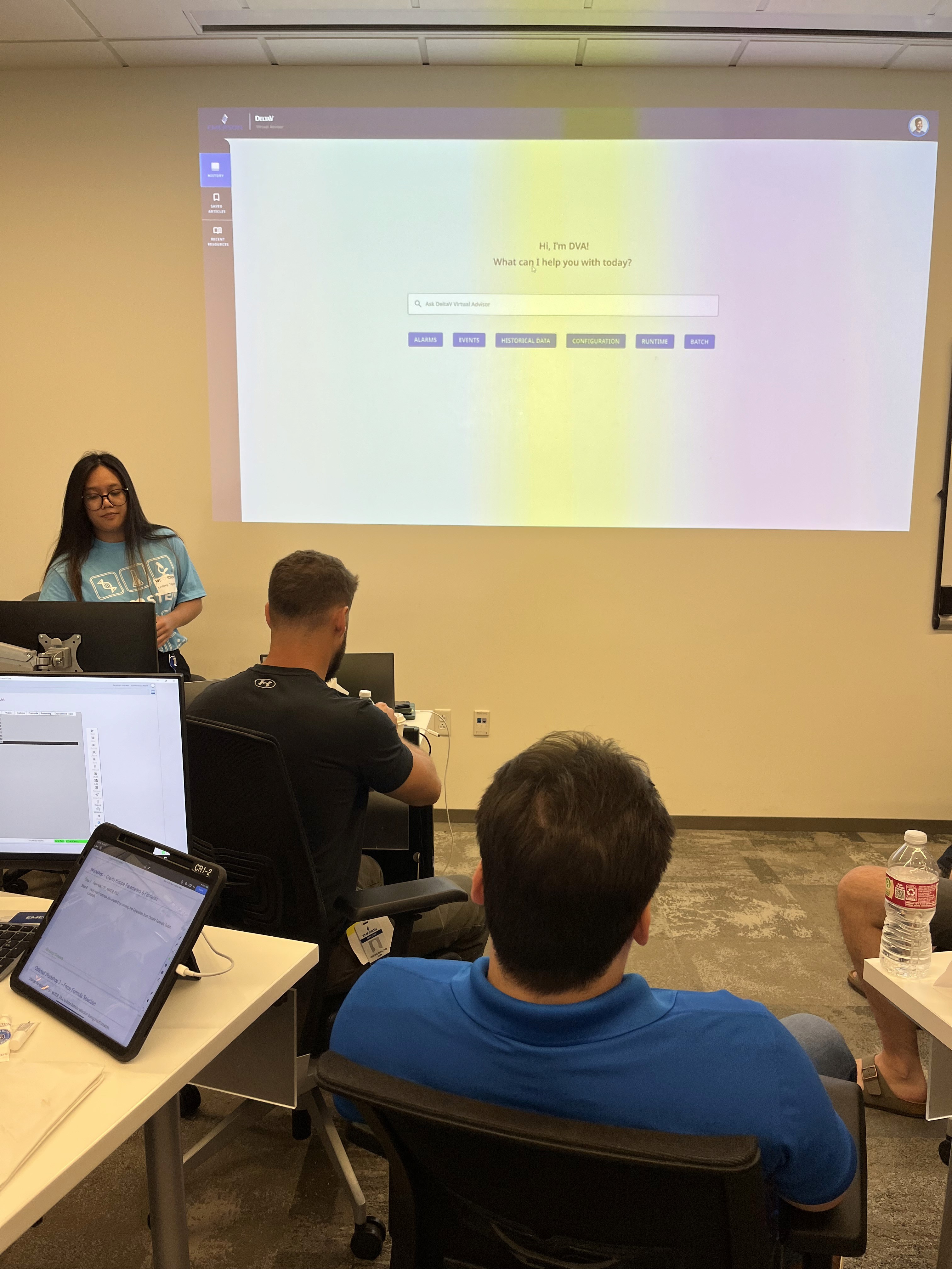
What I expected to hear: users need faster access to information.
What I actually heard: faster access means nothing if you can’t trust what you’re reading.
A recurring theme was documentation validity — how would users know the information DVA surfaced was accurate, current, and safe to act on? In high-stakes situations, a wrong answer isn’t just unhelpful. It’s dangerous. My mentor pushed me to stay in the questioning mindset longer than felt comfortable — keep asking, keep iterating, don’t rush to the solution. That discipline kept the research honest.
Users won’t adopt a tool they don’t trust — even if it saves them time.
Validation, transparency, and source clarity had to be designed into DVA from the start, not added later. The problem wasn’t only about speed. It was about speed and confidence.
The shift
From a search tool to an operational layer.
The original concept was a chatbot that summarized documentation. But the research made it clear that wasn’t enough. Users don’t just need information — they need to know something is wrong, know what to do, and have a record that they did it.
So DVA became a documented chain of accountability. Findings get flagged, reviewed, and verified against source documentation. Nothing gets acted on without a trail. That single shift moved DVA from reactive to proactive — surfacing alerts instead of waiting to be asked, in an interface designed to feel approachable in an environment that can feel dense and technical.
Solutions
Three flows, each solving a different layer of the problem.
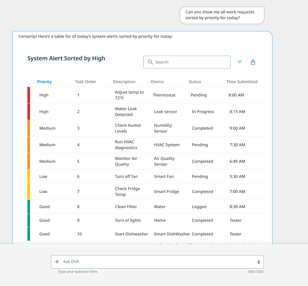
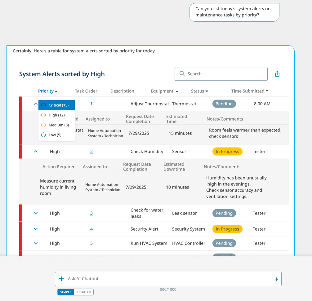
Alerts that come to you
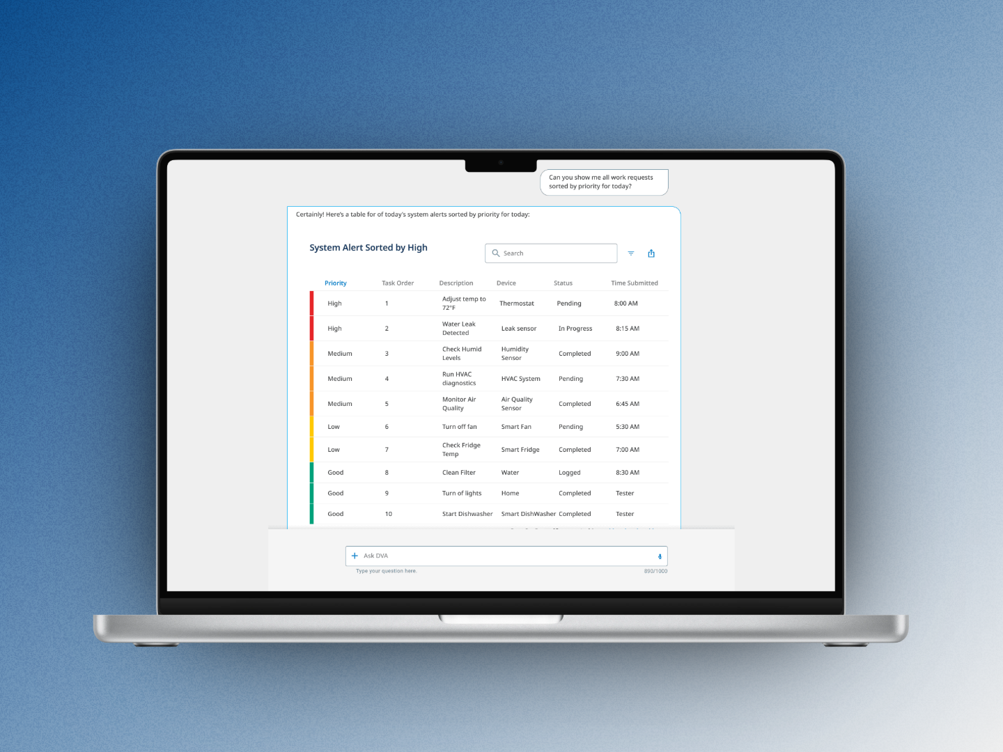
The first flow flipped the dynamic. Instead of users searching for what’s wrong, DVA surfaces it — pulling and sorting live system alerts by priority into a structured, scannable table with status indicators and expandable detail rows. The information stopped being buried; it became the first thing you see.
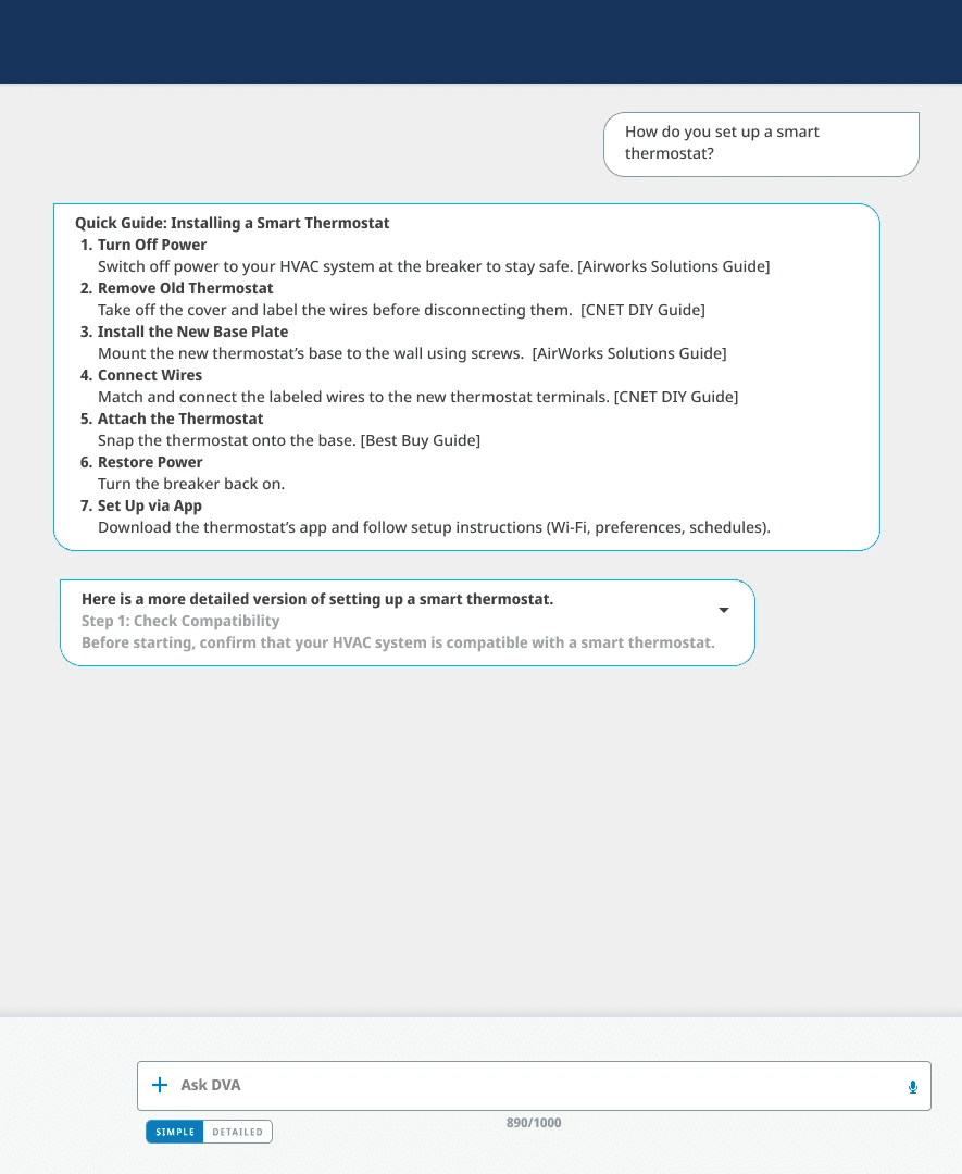
From summaries to cited answers
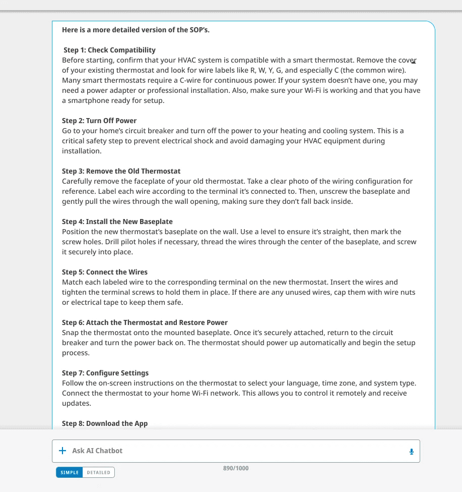
The second flow addressed trust directly. A user asks; DVA responds with a clear, structured answer — but every step is cited back to its source document and author. A Simple / Detailed toggle gives users control: a quick answer when time is short, full documentation when confidence matters.
A library you can actually return to
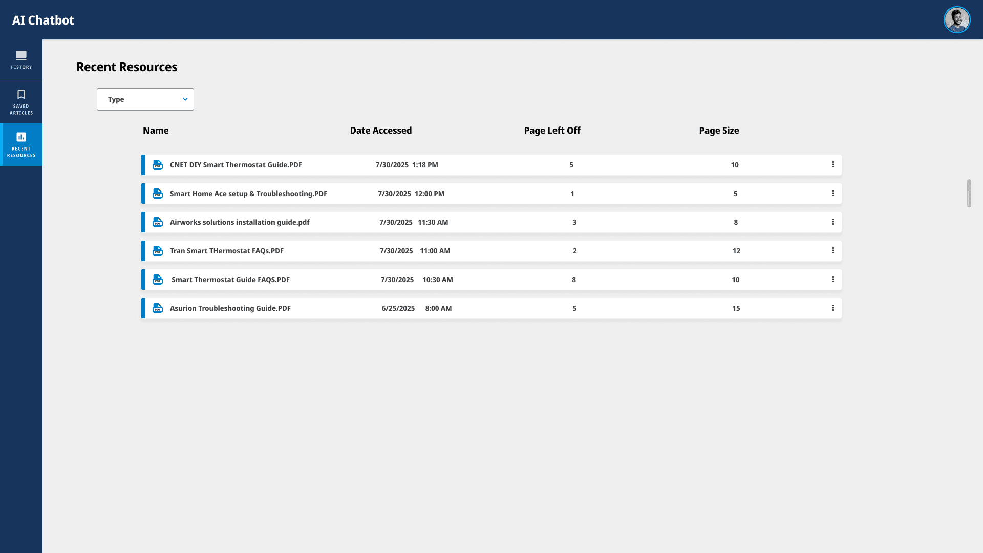
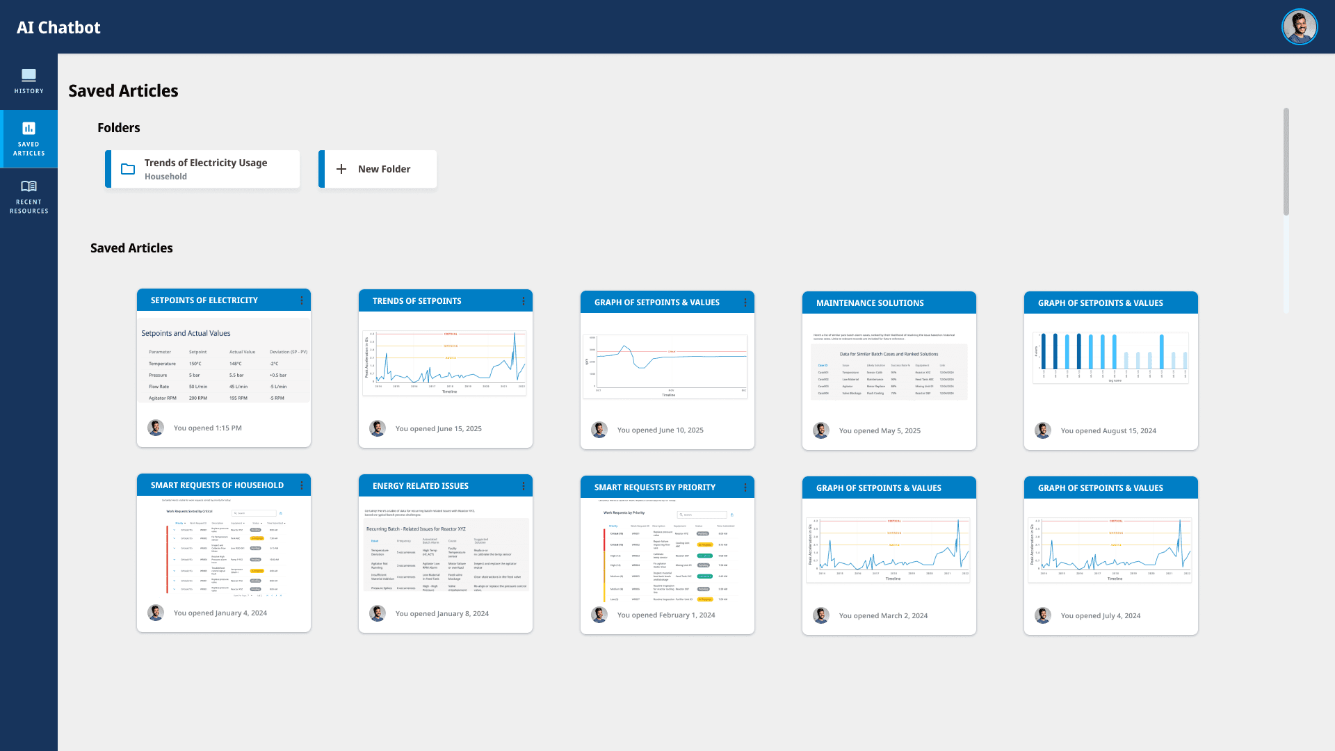
The third flow solved a problem users immediately recognized — finding something once doesn’t mean you can find it again. DVA includes a document library to bookmark responses, organize them into folders, and return to past findings. Recent resources, saved articles, and chat history all live in one place, accessible from the sidebar.

Capstone
The same problem, turned inward.
DVA was built for the people managing a live platform. The capstone asked a quieter but just as urgent question: what happens when the designers building that platform can’t access the knowledge sitting right beside them?
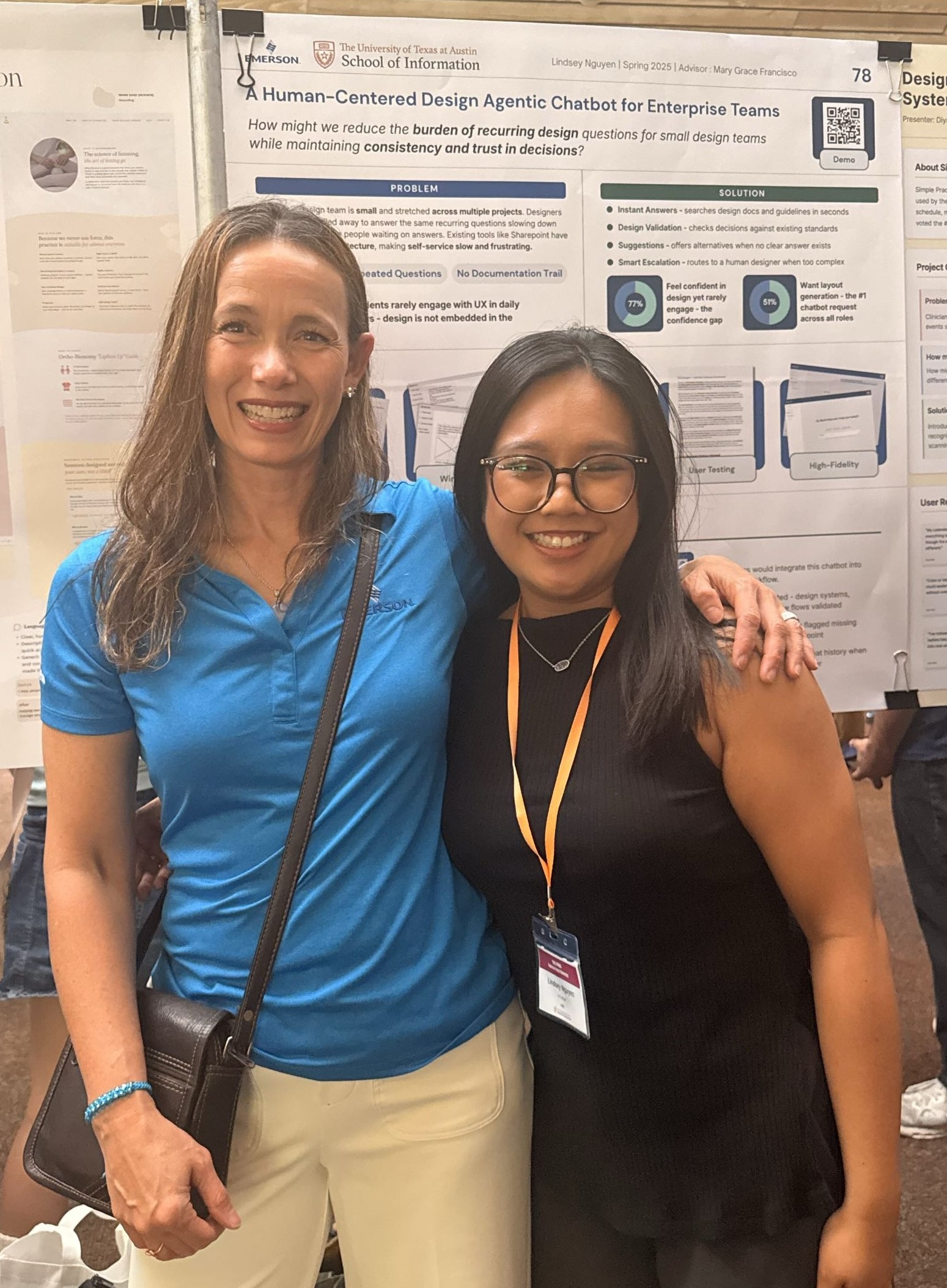
Emerson’s design team is small, stretched thin, and constantly interrupted by the same repeat questions — with no real way to self-serve. So I applied DVA’s core logic internally: instant answers from design docs, validation against existing standards, and escalation to a human designer when a question is too complex.
The research surfaced a tension that felt immediately familiar. 77% of contributors felt confident in their design decisions — but rarely engaged with UX day to day. Confidence without connection. People had strong instincts but no easy way to check them against the system they were designing within.
51% wanted layout generation, making it the single most-requested feature. They didn’t just want answers — they wanted a collaborator that could move with them.
Usability testing validated all three flows. Both test users said they’d use it in their real workflow — not as a novelty, but as something that would genuinely change how they worked. That’s the moment a concept stops being an exercise and starts being a tool.
Reflection
The best design decision I made was the one I didn’t expect to make.
DVA was my first fully solo design project, and I watched it move toward becoming a real product. That distance gives me a clearer view of what I’d do differently. I’d go deeper on AI-specific research from the start — how users mentally model an AI tool, what they expect it to know, where they assume it will fail, how much they’ll trust it before they’ve tested it. More targeted questions there would have shaped the trust solutions earlier.
I’d also ask more directly about the cognitive load of managing multiple screens and data sources at once. Users aren’t just looking for information — they’re already watching several things simultaneously. Designing for that divided attention, rather than assuming DVA would get their full focus, is something I’d bring into the research from day one.
What I’m most proud of is the moment the brief changed — walking into research thinking the problem was speed, walking out knowing it was trust, and then letting that actually reshape the designs.
This case study has been modified from its original form and is presented as a conceptual illustration for portfolio purposes.
See next